
An online booking site where half of the visitors leave the homepage without clicking a single link: we’ve all seen this case. The problem almost never comes from the design, but from the website’s structure itself, that is, how the pages are organized and linked together. Structuring this architecture before touching any visuals is the key for every visitor to find what they are looking for in just a few seconds.
Keyboard navigation and heading hierarchy: what regulations require from the site structure
Since June 28, 2025, the European Accessibility Act has made digital accessibility mandatory for a large part of private services: e-commerce, banking, transport, telecoms, media. We are no longer talking about a good UX practice reserved for the public sector.
In France, the DGCCRF began its first inspections in January 2026. Fines can reach 7,500 euros per violation, doubled in case of repeat offenses, with penalties capped at 300,000 euros. The site structure and navigation architecture are directly in the crosshairs.
In practical terms, this means that each page must adhere to a coherent heading hierarchy (unique H1, then H2, H3 without level jumps), offer explicit links (no “click here”), and allow for complete keyboard navigation. A site structure that makes certain sections reachable only via a dropdown menu controlled by mouse hover poses a regulatory compliance issue, not just an ergonomic one.
Before listing the pages to create, we check that the proposed hierarchy remains navigable without a mouse, with a screen reader, and that each depth level remains accessible within three clicks maximum.
Website structure: group pages by intent, not by internal service
The most common mistake is to map the structure to the company’s organizational chart. We create a “Management” tab, a “Sales Department” tab, a “Customer Service” tab. The visitor, however, does not know the organizational chart. They are looking for an answer to a specific need: to buy, compare, contact, apply.
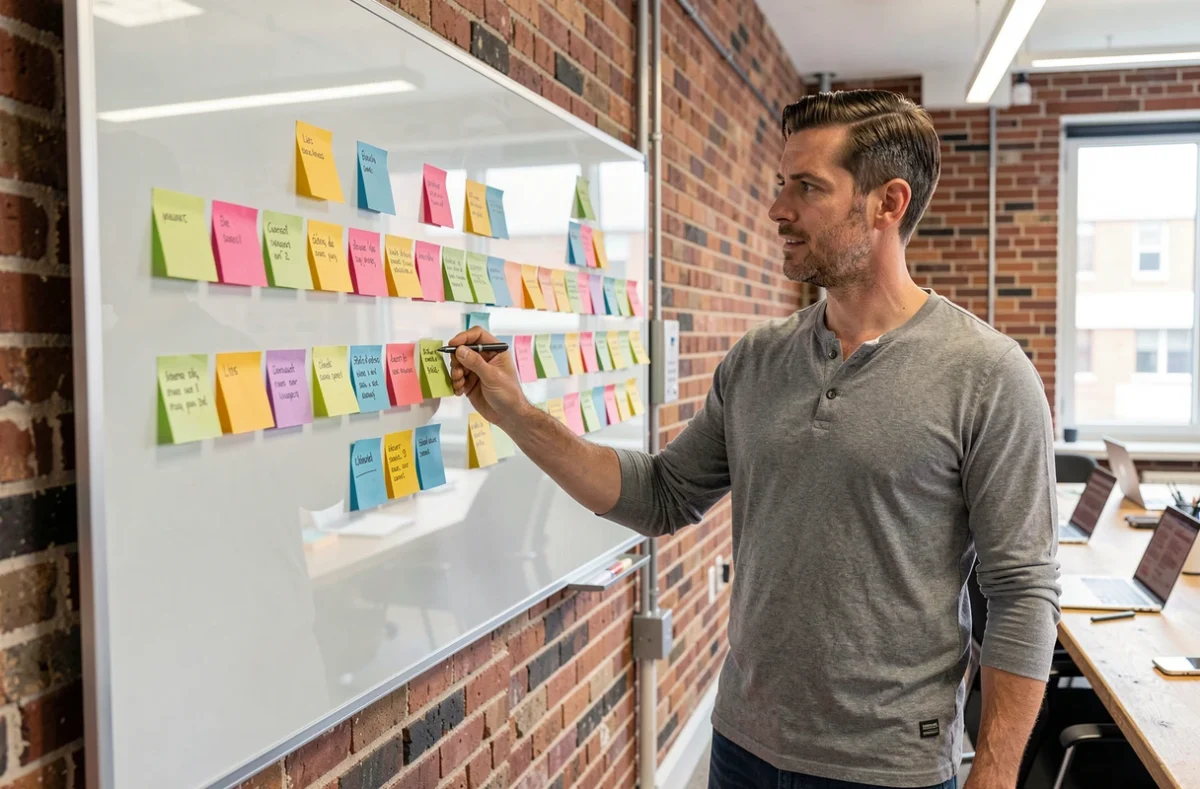
We therefore structure the pages by user intent. An effective grouping looks like this:
- Transactional pages: product or service sheets, quote page, booking form. They respond to “I want to buy or obtain something.”
- Informational pages: blog, guides, FAQ. They respond to “I want to understand before deciding.”
- Trust pages: about, testimonials, legal notices. They respond to “I want to know who I am dealing with.”
- Contact and recruitment pages: form, contact details, job offers. They respond to “I want to talk to someone or join the team.”
This breakdown allows us to verify that no major intent is orphaned in the navigation. You can check always-unique.net for the site map and observe how a sitemap reflects this logic of grouping into categories readable by both search engines and visitors.
Depth of the structure: stay within three levels
A flat structure (all pages at the same level) overwhelms the visitor. A structure that is too deep (five or six levels of submenus) buries the content. The compromise that works in most cases: a maximum of three levels of depth.
Level 1: the main sections visible in the main menu. Level 2: the subpages accessible from each section. Level 3: detailed content (blog articles, individual product sheets). Beyond that, we lose both the visitor and the indexing bots, which struggle to crawl pages too far from the homepage.
Internal linking and user experience: connecting pages to each other
Having a clear structure is not enough if the pages exist in silos. Internal linking, that is, the contextual links from one page to another, guides the visitor through a logical path and transmits SEO weight to priority pages.
On the ground, we apply a simple rule: each page receives at least one incoming link from another page on the site, and each page contains at least one outgoing link to a higher or complementary level page. A page without an incoming link is an invisible page, both for Google and for the visiting user.
Prioritize strategic pages in the menu
The main menu has a limited capacity. Beyond seven entries, attention drops. We only place pages that correspond to the most frequent actions of visitors. Secondary pages (legal notices, privacy policy, HTML sitemap) find their place in the footer.
Feedback varies on this point: some B2B sites place the “recruitment” page in the main menu because the recruitment issue takes precedence over the volume of visits. The decision depends on the current business priority, not a universal rule.

Test the website structure before going live
A structure that seems logical on a hierarchy diagram may fail with real users. Before coding, we test with a clickable prototype or a simple shared document.
- Ask three people outside the project to find specific information (a price, an address, a contact form) starting from the homepage.
- Time how long it takes: beyond a few seconds of searching, the structure has a readability issue.
- Check that the path works on mobile, where the menu is reduced to an icon and the sub-levels are harder to reach.
This test almost always reveals ambiguous menu labels or poorly classified pages. Correcting the structure at this stage costs a few hours. Correcting after going live, when URLs are indexed and redirects need to be managed, costs weeks and degrades SEO.
The structure of a website is not a theoretical exercise that is settled once and for all. With each addition of a page or section, we check that the new content fits into an existing level without creating an orphan branch. A regularly maintained sitemap remains the best investment to keep navigation smooth, compliant with accessibility requirements, and readable by search engines.